
Girls Who Code At Home
Activist Toolkit Part 4
Building: Intro to CSS

2
Activity Overview
Now that you have some HTML written for your website, it’s time to beautify it with some CSS, or
Cascading Style Sheets! CSS, describes what kinds of presentation rules – or styles – should be applied
to HTML elements. For example, if you wanted to make the text larger or smaller you would do that using
CSS. CSS allows you to change the way content on your website looks, including text color, text size, the
fonts used, background colors or images, and so much more. There are so many different ways you can
style your website but in this tutorial we will show you how to style the text, images, the navigation bar, and
take action checklist.
PART 5
BUILDING
Make it
Responsive
with CSS
Add styling
that adapts
your site to
different
screen sizes.
PART 2
PLANNING
Wireframe
& Mockup
Layout the
skeleton of
your website,
then add in
your design
elements.
PART 3
BUILDING
Intro to
HTML
Build the
framework of
your site
using HTML.
PART 4
BUILDING
Intro to
CSS
Style the
HTML
elements on
your site
using CSS.
PART 1
PLANNING
Research &
Feedback
Identify and
research a
cause.
Materials
➔ Computer
➔ Trinket or the text editor of your choice
➔ Your Mockup from Part 2
➔ Code you wrote during Part 3
➔ Part 4 Example Code
Example Project
Buy the end of Part 4, your
website will have colors,
fonts, and more!
HTML
CSS
Note: If you did not complete Part 3,
you can access Parts 1 and 2 here. If
you have some experience with HTML,
you can remix and use the Part 3
Example Code that stops at the end of
Part 3.

BRAVERY
When Chieko lost her sight there was no technology available to help her
read and learn like she used to. How would you feel if you were in Chieko's
position? Discuss ways she displayed bravery in the face of this new
challenge.
3
Women in Tech Spotlight: Chieko Asakawa
people to browse the internet. Chieko continues her work as an IBM Fellow at T.J Research Center
and as a Distinguished Service Professor at Carnegie Mellon University. Her research continues to
create technology to improve website accessibility and usability for the visually impared. In 2003
Chieko was honored with a spot on the Women in Technology International Hall of Fame, in 2013
the Japanese government awarded her with the Medal of Honor with Purple Ribbon, and in 2017
she was elected as a member of the US National Academy of Engineering.
Chieko’s current project is developing a tool to help visually impaired people travel independently.
This technology will utilize artificial intelligence (or AI) to recognize objects, people, expressions,
and navigation systems to help people travel.
Watch this video to learn more about Chieko and her work to create IBM Watson to make cities
around the world more accessible. Want to learn more about Chieko? Check out Chieko’s Ted Talk
and read this BBC article.
Share your responses with a family member or friend. Encourage others to read more about Chieko
to join in the discussion!
At the age of 11, Chieko was involved in a swimming
accident where she injured her eye. At 14, she lost her
sight completely. She now found herself having to ask
others for help to complete what was once a simple
task. Chieko did not let this deter her way of life and
worked to create technology to help her gain
independence.
In 1984 Chieko joined the IBM Research team and
began developing a digital library for Braille
documents. She also created a plugin that converts
text to speech to make it easier for visually impaired
Image Source: TED
Being a computer scientist is more than just being great at coding. Take some time to reflect on
how Chieko and her work relates to the strengths that great computer scientists focus on building -
bravery, resilience, creativity, and purpose.
HTML
4
Step 1: Explore How HTML & CSS Work Together (2 mins)
In Part 3, you learned about HTML and how to structure a webpage using HTML elements. But it didn’t
look that pretty. HTML doesn’t mess with aesthetics or presentation - that’s all CSS.
CSS, or Cascading Style Sheets describes what kinds
of presentation rules – or styles – should be applied to
HTML elements. For example, if you wanted to make
the text larger or smaller you would do that using CSS.
CSS allows you to change the way content on your
website looks, including text color, text size, the fonts
used, background colors or images, and so much
more.
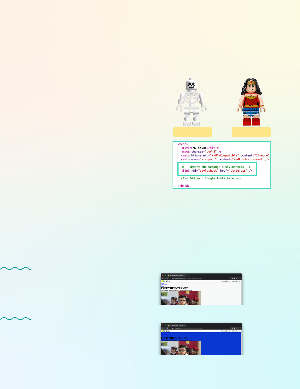
CSS rule sets go in their own file with the extension
.css. Usually it is called style.css or styles.css. To
connect the CSS file to an HTML file, we must link the
stylesheet to our webpage between the <head> tags.
Note: You can have multiple CSS files in a website.
Step 2: Add Your First Rule Set (7-10 mins)
Before we dive into defining what CSS is, let’s compare two examples and make some observations about
how it works. Think about these questions:
➔ What do you think the purple text does?
➔ What do you think the green text does?
➔ Why are the results below different from each other?
CSS
EXAMPLE 1
background-color: blue;
/* Add a background color */
body {
}
EXAMPLE 2
body {
background-color: blue;
/* Add a background color */
}
RESULT 1
RESULT 2

5
CSS creates rules for displaying content (e.g. text, images, etc) through rule sets. Rule sets are made up
of CSS properties like the background-color property above. You can assign different values to those
properties to change how the website looks. The background-color property takes the color value
blue, but we could also use a numerical hex value like the ones you recorded in your mockup. All CSS
properties contain a property name, colon, value, and semicolon to end the declaration.
Step 2: Add Your First Rule Set (cont.)
body {
background-color: blue;
}
selector
declaration
block
background-color: blue;
property name property value
There are hundreds of different properties you can use
to style your website. Properties are only useful if our
browser knows which elements to apply them to on the
website. This is why Example 1 didn’t work - the
browser didn’t know which element to apply it to
because it was not inside of a rule set.
CSS rule sets allow us to apply specific properties to elements on our website. Click on the styles.css
file. Let’s look at a rule set for the <body> element already included in our CSS file.
We can see a rule set is made up of:
➔ a selector that determines where the styles
are being applied.
➔ a declaration block, contained between {}s,
that lists all of the individual styles to be
applied.
Finally, the green text is a comment. To create a CSS
comment, we add our comment between the symbols
/* and */. Remember: comments are not visible on your
website and used only to leave notes to ourselves and
other people about our code.
The Element Selector
There are three different ways of selecting elements that we will discuss in the coming steps. The
simplest is the element selector. It uses an element’s tag to specify where the rule set should apply.
<h2>Piglet</h2>
<p>This piglet is SO
cute!</p>
<h2>Baby Hedgehog</h2>
<p>It’s pretty cool how
hedgehogs can roll
themselves up.<p>
h2 {
font-size: 14 px;
font-weight: 600;
color: teal;
}
Piglet
This piglet is SO cute!
Baby Hedgehog
It’s pretty cool how hedgehogs
can roll themselves up.
HTML CSS RESULT
/* Add a background color */

6
In this example, we use the h2 element selector to apply a CSS rule to all the level 2 heading elements
<h2>. If you want to set the font size or color of all elements with the same tag, the easiest way to do
this is to use the element selector.
You Try It!
Try adding some properties inside an existing rule set based on your mockup. For example, we know that
we want to change the background color. Add the background-color property the body rule set. Use
your mockup notes to add a color value. Let’s see how it displays:
Step 2: Add Your First Rule Set (cont.)
➔ Save your project.
➔ Open your project in a new tab if it isn’t already. (You can
do this by clicking Share > Publish > Site URL).
➔ Reload the tab with your full website so it updates with
the changes.
Step 3: Style Your Text (7-10 mins)
Let’s kick off our styling journey with our text elements! These include all the elements that have, well, text
in them, such as elements that use <h1>, <h2>, <h3>, and <p> tags. We’re starting here because it will
help us visualize how to position other elements later on.
Add Your Fonts to the .html Files
First we need to import the fonts you chose in Part 2 from Google Fonts. Lucky for us, Google makes this
process easy. You can follow the steps below or watch this video for instructions.
➔ Go to your mockup and copy the links to the font families you chose.
➔ Click the Select this Style on the fonts you want to be able to use in your site.
➔ Click Embed. This will give you the embed link you need to put in your .html files.
➔ Copy the embed link.
➔ Open the index.html file and locate the comment between the <head></head> tags that tells you
to add fonts. Paste the embed link in between the <head> tags.
➔ Repeat this step on the take-action.html and about.html files.
We added the background-color
property to the <body> element.

7
font-family
Specifies a font for an element. You can include many font names as a "fallback" system. If the
browser does not support the first font, it tries the next font. Often you will see a specific font like
Roboto and a generic font like sans-serif. Learn more.
Syntax font-family: “family-name”, generic-family;
Example font-family: "Roboto", sans-serif;
font-size
Sets the size of a font. Learn more.
Syntax font-size: value in px, em, cm or small, medium, large;
Example font-size: 10px;
text-align
Specifies the horizontal alignment of text in an element. Learn more.
Syntax text-align: left | right | center | justify;
Example text-align: center;
color
Sets the color of the text. Read more on color values. Learn more about the property.
Syntax color: color keyword | hex colors | RGB colors;
Example color: teal; color: #ffffff;
Step 3: Style Your Text (cont.)
Text and Font Properties
Now that we can reference these fonts in your CSS stylesheet, let’s learn about a few text and font
properties we can use to style our words.
Try adding these CSS properties to your text elements. These are just a few of the font and text
properties available to you. You can also try line-height, letter-spacing, text-decoration,
font-weight, and more. Try googling these properties to see if you can find more information about
them and use them in your stylesheet.
Note: If you want to apply a font family to all elements, define it in the body rule set. If you want to use
other fonts in specific elements, define the font family in the rule set for that particular element.
Once you have finished adding your text properties, test your site to see how it turned out. Save your
project and reload the tab with your full website to see the changes.

8
Step 4: Practice Styling Elements with Classes & Ids (12 mins)
Remember how we mentioned that there were three ways to select elements for styling? We’ve already
reviewed the first type of selector, the element selector. This will let us select a <p> tag and apply a CSS
rule, such as setting the color of the text to red. But what if I want the paragraph text at the top of my page
to be orange and the paragraph text at the bottom to be teal? Luckily, there are two other selectors that we
can use for this: the class selector and the id selector.
These selectors use the id or class attribute of an HTML element to specify CSS rules for an element or
group of elements. Here is an example in action:
<p id=”top”>Hello World!</p>
<p>I’m CSS!</p>
<p class=”bottom”>It’s nice to
meet you CSS.</p>
<p class=”bottom”>It’s nice to
meet you HTML.</p>
#top { color: orange; }
p { color: blue; }
.bottom { color: teal; }
Hello World!
I’m CSS!
It’s nice to meet you
CSS.
It’s nice to meet you
HTML.
HTML CSS RESULT
Using Class and Id Attributes in HTML
You need both parts for this to work: (1) the id or class element in the opening tag of an HTML element
(e.g. ”top”) AND (2) the id or class selector of a CSS rule set (e.g. #top). If you haven’t already guessed
it, this allows us to distinguish between elements by giving them unique attributes, which is pretty cool.
First, let’s talk about how to add an id or class selector to your HTML.
<h1>Hello World!</h1>
Opening Tag Closing TagContent
Element
<h1 class=“hello”>Hello World!</h1>
Opening Tag Closing TagContent
Element
Keyword Class or Id Name
To assign your element a class attribute,
add the following inside the opening tag:
the keyword class, an equals sign, and a
unique class name inside double
quotation marks. Adding an id attribute is
the same, except you use the keyword id:
Recall the basic parts of an HTML
element we learned about in Part 3.
<h1 id=“cool”>My Cool Title</h1>

9
Using Class and Id Selectors in CSS
Now we need to create the corresponding rule set in our style.css file.
➔ Class: Define the rule set with a . followed by the class name.
➔ Id: Define the rule set with a # followed by the id name.
There are lots of different ways to get even more specific about which
elements you want to apply rules to in your CSS. See this handy
reference from W3Schools.
Step 4: Practice Styling Elements with Classes & Ids (cont.)
.hello {
color: purple;
}
#cool {
font-size: 20px;
}
Classes vs Ids: Which One Should I Use?
So far, we haven’t talked about the difference between classes and ids. Here is the main distinction: the
id can only be used ONE TIME in an .html file (a.k.a. a page) to specify an element. You can use the
class selector MULTIPLE TIMES in a .html file to select an element.
If you are trying to choose between the two, it can be helpful to describe what you want to accomplish
by using this element. Let’s review two scenarios to learn what each selector does and when to use it:
I need to attribute images in a few places on my
homepage and across my website. The paragraph
text is way too big - I need to change the font size.
The subtitle looks the same as the rest of the test,
but this is special text - I want it to stand out. In
fact, it is so special that I only want this subtitle to
look this way on this page - it is singular, so I
won’t style anything else like it.
SCENARIO 1
SCENARIO 2
Use an id attribute! We only need to use this
element one time on a page.
<p id=”subtitle”>Your Text Here</p>
#subtitle {
font-size: 25px;
text-align: center;
}
Use an class attribute! We will use this element
more than once on a page.
<p class=”attribution”>Image from X</p>
.attribution {
font-size: 10px;
text-align: center;
}
You Try It!
Add a class and/or id attribute to an element based on the needs of your project, then create a CSS rule
set for it. Once you have finished adding your text properties, test your site to see how it turned out.
Save your project and reload the tab with your full website to see the changes.

10
How did it turn out? If it doesn’t display the way you want it to, check the following:
➔ Did you add the class/id attribute to the opening tag of your element in the HTML file?
➔ If you used an id selector, did you use the # symbol to define the corresponding rule set in your
CSS file?
➔ If you used a class selector, did you use the . symbol to define the corresponding rule set in
your CSS file?
A Note About Specificity
Sometimes when you write CSS rules, the rules conflict. The browser follows some of its own rules to
determine which CSS rule to apply to an element. Here are some things to keep in mind:
➔ Rules written later in a CSS file will overwrite a previous rule.
➔ The more specific the element selector you use, that rule will overwrite a less specific selector
rule written later in the CSS file: classes are more specific than elements and ids are more
specific than classes.
Step 4: Practice Styling Elements with Classes & Ids (cont.)
Step 5: Meet the Box Model (12-15 mins)
So far, we know how to style our text and how to use CSS selectors. One big thing we have not discussed
is how to position our text. Right now, your text is probably hitting the edge of your browser or running into
an image. Let’s fix that with the box model.
The Box Model
An important concept central to laying out or
positioning HTML elements on a webpage is the CSS
box model. In the CSS box model, HTML elements are
treated like boxes, and the element is wrapped in a
series of boxes that specify the margin, border, and
padding around the HTML content.
padding This is a transparent or clear area around the
content.
padding: 10px; /*all sides*/
padding-left: 30em;
border This is a border that goes around the padding
and content.
border-style: solid;
border-width: 5px;
margin This is a transparent or clear area that goes
around the outside of the border.
margin: 3%; /*all sides*/
margin-bottom: 50px;

11
Position Your Header
Let’s practice using these properties by positioning our header. To the left is how it currently displays
and to the right is how we want it to display.
Step 5: Meet the Box Model (cont.)
Our goal is to center the header and give it some breathing room on the top, left side, and right side. We
want it to be below the nav bar and above the main portion of our website. So what properties do we
need? We don’t need a border, so it’s down to the two other options: padding and margin. But how do
we know if we need to use one or both? Let’s try both and compare them:
➔ Padding can have a background color.
➔ Padding stacks on top of each other.
➔ Padding cannot have negative values.
➔ Padding adds to the area of an element that
can be clicked.
➔ Padding (and border) add to the total size of
an element.
➔ Padding cannot overlap each other.
➔ Margins are always transparent.
➔ Margins collapse into each other.
➔ Margin can have negative values.
➔ Margin does not add to the area of an
element that can be clicked.
➔ The margin does not add to the total size of
an element.
➔ Margins can overlap each other.
MARGINS PADDING
Current header positioning Desired header positioning
The margin property doesn’t affect the positioning of our element, so we want to use the padding
property. Check out the comparisons and contrasts* below to learn more.
header {
margin-top: 50px;
margin-left: 30%;
margin-right: 30%;
}
header {
padding-top: 50px;
padding-left: 30%;
padding-right: 30%;
}
* Information pulled from Tania Rascia’s tutorial on the box model. Check it out to learn more!

12
Here is one helpful rule of thumb: we
use padding to give elements size and
margin to separate elements.
The padding property makes our
<header> element bigger in order to
position it on the page.
Step 5: Meet the Box Model (cont.)
You Try It!
Use the box model properties we
learned about to style the <main>
element in the main CSS rule set. Note
that the positioning of the <main>
element will affect the position of the
elements inside of it such as the
<img>, <h2>, and <p> elements.
Once you have finished adding your box model properties, test your site to see how it turned out. Save
your project and reload the tab with your full website to see the changes.
Step 6: Style Your Images (5-7 mins)
Similar to styling text, there are many different CSS rules you can write to style images on a website. We
will just be showing you a few, but you should explore and add other rules on your own!
Displaying the Images
First we need to tell the browser how we want to display the
image on our webpage using the display property. We
want these images to be blocks - that is, we want each
image to start on a new line and take up the whole width of
the page.
Create an img rule set in the /*
HOMEPAGE */ comment section, then
add the display property.
img {
display: block;
}
Based on the sample mockup, we know that we want the
images to be centered on the page in a horizontal row with
no other elements on the left or right. We will cover how to
position your images in a row in Part 5. For now, let’s see if
we can get the images centered on the page.

13
Sizing the Images
You may have noticed some of the images you added to your website were quite large. You can resize
them by using the width property. This property can take pixel (px) and percentage (%) values. When you
use a percentage width, the image will resize to fill the specified percentage of its container. For example,
if you set width: 50%; the image will have a maximum width of half of the container. We set the height to
auto to keep the image ratio. You can read more about these properties here.
Try experimenting with the height and width properties in your img rule set, then test your site to see how
it looks!
Centering an Image
Right now, the images look centered, but they actually are a little bit off. To fix this, we need to implement
the margin property on the right and left side of the image. We can either set the margin-right and
margin-left to equal values or set it to auto. By setting the property value to auto we let the browser
figure out those values for us.
Add these properties to your img rule set, then test your website to see how it looks. See the example rule
set below if you need some guidance.
Step 6: Style Your Images (cont.)
Finish Styling Remaining Elements in the <header> and <main> Elements
Use your mockup to finish styling any elements inside your <header> and <main> elements.
Remember that you may want to create classes or ids for some of these.
Once you’re finished, test your website to see how it appears and make any changes. When you are
satisfied, move onto Step 7.
Add these properties to your img
rule set. Change the values based
on your mockup.
img {
display: block;
width: 90%;
height: auto;
margin-left: auto;
margin-right: auto;
margin-top: 20px;
}

14
Step 7: Style the Nav Bar (10 mins)
Navigation bars or nav bars are an essential part of a website, allowing the user to move back and forth
to different pages on a website. There are some standard designs and structures used for nav bars,
including vertical and horizontal layouts. We will walk you through styling your navigation bar
horizontally, but if you want to explore more ways to style your navigation bar we recommend checking
out this resource from W3Schools or this resource from MDN.
Style the <ul> Element
To style our navigation bar, we will focus on applying styles to
the <ul>, <li>, and <a> elements. First, let’s remove the
bullets from the unordered list, or <ul> element, most nav
bars don’t have bullets. In order to do this you will set the
property list-style-type to none for the ul element. You can
also give your nav bar a background color by setting the
background-color property for the ul element. The overflow
property helps give our ul property height so it is displayed
properly. (We need to use it if we use the float property, which
we use below.)
Style the <li> Elements
Next let’s make the elements in our list, or the <li> elements
display in a horizontal line rather than stacked on top of each
other. We can do this by adding a rule set and setting the
display property to inline. Unlike the block value we
used for the img tag, inline allows multiple elements to be on
one line. We also want them positioned on the right side of
the page, so we will use the float property and set it to right.
You should see something similar to this:
Add these properties to the ul rule set
under the /* CSS FOR NAV BAR */
comment. Change the color value
based on your mockup.
ul {
list-style-type: none;
background-color: #43d6b9ff;
overflow: hidden;
}
Add these properties to the li rule set
under the /* CSS FOR NAV BAR */
comment.
li {
display: inline;
float: right;
}
Remember that a navigation bar is just a list of links. Right
now, your HTML for your navigation bar should look similar to
the HTML on the right.

Style the <li> <a> Elements
Next let’s style the links inside the list <li> elements.
Remember that we can create hyperlinks using the <a> or
anchor element. To select the <a> element inside of <li>
element, we use the selector li a. This means whatever
rules we create for these anchor elements will only be applied
to anchor elements inside a list element* (remember,
specificity matters). We can remove the underline by setting
the property text-decoration to none and change the text
color using the color property. We can also change the
font-size and add some padding to make the clickable
area larger.
Next, we want to notify the person using our site that this text
is clickable. We can apply a style to the anchor element only
when someone hovers their mouse over it by use the li
a:hover selector.*
Test your site to see how it displays. If you used values
similar to the example project, it might look similar to the nav
bar below.
15
Step 7: Style the Nav Bar (cont.)
Try adding a few of the properties to
the li a rule set. Change the color
value based on your mockup.
li a {
font-size: 15px;
color: #0D38D3;
text-decoration: none;
padding: 14px;
}
Add styling for a mouse hover.
Change the color value based on your
mockup.
li a:hover {
background-color: #0D38D3;
color: #fdd946;
}
Distinguish Between List Elements
The nav bar looks great on our pages. But when we test the
Take Action page, there is a problem. It seems like the checklist
is now styled like the nav bar - and we definitely don’t want this!
Based on what we’ve learned so far, what is one possible
solution?
Using a class selector will allow us to style the <ul> and <li> elements on the nav bar in one way,
then the <ul> and <li> elements on the checklist another way.
* For more on how to use CSS selectors, see this CSS selector reference from W3Schools.
Use a class selector!

ul.nav-bar { }
li.nav-item { }
li.nav-item a { }
li.nav-item a:hover { }
CSSHTML RESULT
Instead of just adding the class, we are going to get more specific.* We are going to attach the class to
the element. This will tell the browser to select the <ul> element with id="nav-bar".
Add the text in blue to the opening tag of the HTML elements and the CSS selectors, then test it out.
You can also use your own names, just be sure they match!
16
Step 7: Style the Nav Bar (cont.)
<ul class="nav-bar">
<li class="nav-item">
HTML
Step 8: Style the Checklist on the Take Action Page (7 mins)
It’s time to style our checklist! Right now, we have a <div> tag that is creating a container to group
the <h3>, <ul>, and <li> elements together. We want to be able to style that container, but we can’t
just use div {} as the selector in our rule set because we will often have multiple <div> tags. We
need to assign it a class or an id. We will use an id because we will only have one checklist on this
page.
Let’s update the HTML in the take-action.html file and add a
new rule set in our CSS under the /* Checklist */ comment.
Style the Color and Shape
Use the different color, text, and sizing properties you have
learned about to create the shape of the checklist element.
Add these properties inside the checklist rule set.
➔ Don’t forget to adjust the property values based on
your mockup.
Position the Checklist
Use the box model properties you have learned about to
position your checklist on the page.
➔ Don’t forget to adjust the property values based on
your mockup.
#checklist {
/* Color & Shape */
background-color: white;
color: #0D38D3;
width: 40%;
padding: 50px;
/* Positioning */
margin-left:auto;
margin-right:auto;
margin-top: 50px;
}
The blue on the right shows a
mouse hover.
* For more on how to use CSS selectors, see this CSS selector reference from W3Schools.

Below is an example of possible checklist styling from the sample project. We added some other
border properties like border-radius to add some extra flair. Once you have finished adding your
checklist properties, test it! Go back and make any changes until you’re satisfied.
17
Step 8: Style the Checklist on the Take Action Page (cont.)
To see the styling choices
we made, check out the
Part 4 Example Project.
Step 9: Share Your Girls Who Code at Home Project! (5 mins)
We would love to see your ideas! Share your project with us. Don’t forget to tag @girlswhocode
#codefromhome and we might even feature you on our account!
Follow these steps to share your project:
➔ Save your project first.
➔ Click the Share icon
➔ Choose the Link option in the dropdown menu.
➔ Copy this link and paste it wherever you would
like to share it.
Project Link
