
How to Create a Choropleth Map showing Count of Members by Postal
Code
A choropleth map, sometimes incorrectly called a heat map, can help you understand where your
members live in your section. This can be useful when deciding where to hold face-to-face meetings that
are located close to your members.
A choropleth map is a type of map in which a set of pre-defined areas, such as postal code regions or
geopolitical regions are colored or patterned in proportion to a statistical variable within the area. The
colorations correspond to geographic or political boundaries, whereas the coloration in a heat map
doesn't correspond to boundaries.
The examples below show how one can create a choropleth map from membership data in OU
Analytics. As an important reminder, any data obtained from OU Analytics including these maps must
be used for IEEE business only. See the IEEE Data Access and Use Policy at https://www.ieee.org/ieee-
data-access-and-use-policy.html for more details.
Note the map builder tool we're going to be using only works for US locations. If you know of a tool that
works for other countries or a better tool for US locations please let us know!
Example 1 – Choropleth map of IEEE section members
In this example, a choropleth map will be created for the Boise section in Region 6 showing the number
of IEEE members by zip code.
Step 1 – Gather the count of section members by 5-digit zip code
In IEEE OU Analytics, bring up the Members and Affiliates worksheet and select the "Geographic Counts"
tab. Note this will let you get counts for section members by postal code.

Select the filters as desired. In this example I set the state filter to only include members in Idaho and
Oregon. This excludes some members who live in other sections but have chosen to be assigned to the
Boise section because of where they work.
Use the "Download" button to download the statistical data. Use the Crosstab format then select CSV
format. The data will download to "GEO Count.csv" format, or "GEO Count (#).csv" if a file of that name
already exists.
Step 2. Assign colors to statistical data.
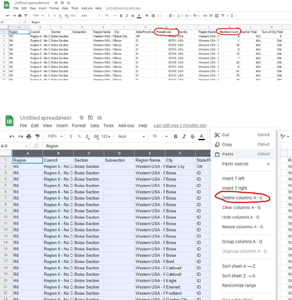
Open the Geo Count file in Google Sheets. To open it, start Google Sheets, open a blank spreadsheet,
click File > Import, click Upload, and select the CSV file from your downloads folder.
Delete all the columns except for PostalCode and Member Count by selecting the columns and clicking
Edit > Delete columns (range).
This is also a good time to rename the spreadsheet to a meaningful name. In this example I renamed it
to “Boise section member counts by postal code”.
Next, click Column B (Member Count), right click for the pop-up menu, and click “Sort sheet Z->A” to
sort the rows by descending member count.

Add a third column to the right of the PostalCode and Member Count columns. Call it Color. Rename the
PostalCode column to ZIPCode.
Assign colors to groups of rows with roughly the same number of rows per group. It works best to assign
three to six colors to the statistical data. Although the software that creates the choropleth maps can
handle more colors, the labels can get confusing plus the mapBuilder tool can be quite slow if it has to
work with many colors.
You can use HTML color names or hex values for the colors. See
https://www.w3schools.com/colors/colors_names.asp for possible color names. For this example we’ll
use DarkRed, OrangeRed, Orange, and Yellow.

Step 3. Display the map using randymajors.org mapBuilder tool.
We'll use the mapBuilder tool at https://www.randymajors.org/custom-color-coded-maps to generate
the map.
Replace the Member Count values with range values. This is optional but makes a cleaner map key. You
may want to save a copy of your spreadsheet with the original counts so you can easily change your
ranges.

To make your Google sheet visible to the mapBuilder tool, share it using these steps from
https://www.randymajors.org/custom-color-coded-maps#createmapform.
(1) Click the Share button in the upper right corner, (2) click the Get link section in the box
that appears, (3) change the sharing setting to Anyone with the link (keep the drop-down to
the right set as Viewer), (4) click the Copy link button, and (5) click Done.
Before you share it be sure you’ve removed all the columns except ZIPCode, Member Count, and Color,
so you don’t unnecessarily expose any data which isn’t needed to generate the map.
Paste the link into the form. Set the Map Title & Display Options at
https://www.randymajors.org/custom-color-coded-maps#createmapform , then click on the View My
Map link.
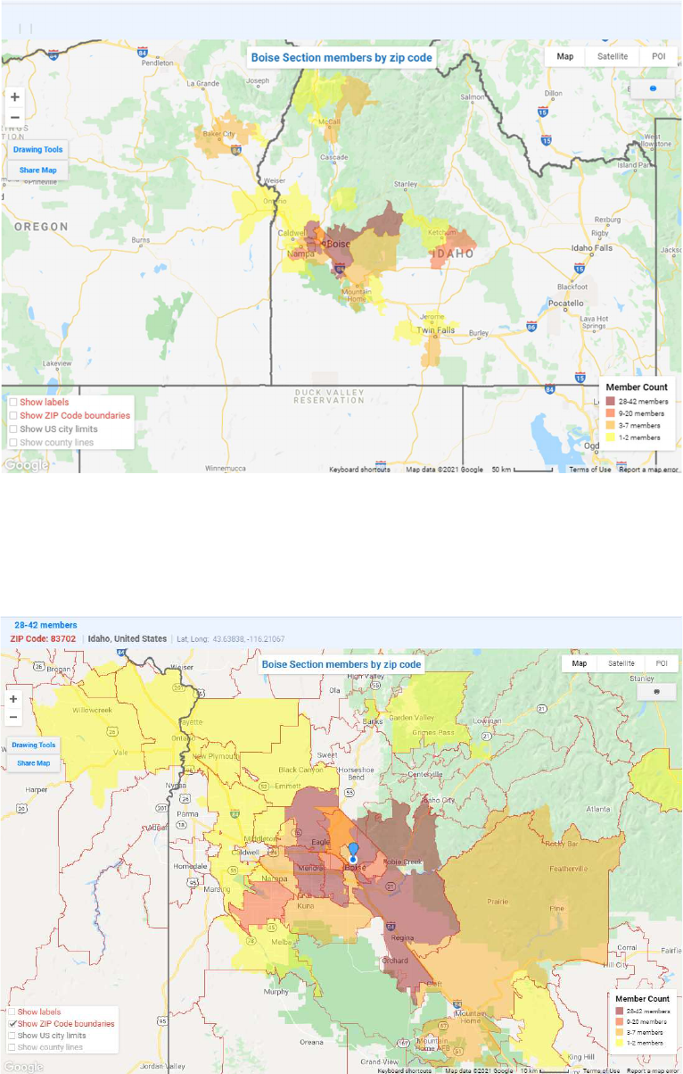
Here is the resulting map for the data in this example.
We can zoom in and out and change settings. We’ll enable "Show ZIP Code boundaries", zoom in on
Boise and the surrounding cities, and put a blue pin on downtown Boise. Note that the colored regions
don't map to the zip code boundaries exactly. This is apparently a discrepancy between the mapBuilder
tool and Google Maps.

Example 2 – Choropleth map of IEEE society members in a section
In this example, a choropleth map will be created for the Utah section showing the number of IEEE
Power & Energy Society members by zip code.
Step 1 – Gather the count of society members by 5-digit zip code
To get counts of society members, you will need to use the Memberships worksheet, download the
membership data, then use Excel to remove the Zip+4 digits from the postal codes to get 5-digit zip
codes, and then generate a pivot table to get the counts by zip code. The resulting pivot table can then
be imported into a Google Sheet for display using the mapBuilder tool using Steps 2 and 3 below.
In IEEE OU Analytics, bring up the Memberships, Subscriptions, and More worksheet and select the
"Detail" tab. Set the filter for Product Name and Section. In this example I set the Product Name filter to
“IEEE Power & Energy Society” and the Section filter to the Utah Section.
Download the results to a CSV file.
Step 2a. Extract the statistical data.
Open the CSV file in Google Sheets. To open it, first open a blank spreadsheet, go to File --> Import, click
Upload, and select the CSV file from your downloads folder.
Delete all the columns except for Postal Code by selecting the columns and using Edit > Delete columns
(range).
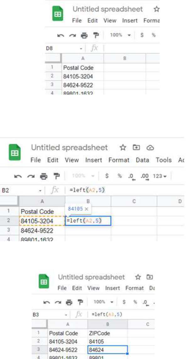
Label Column B as ZIPCode. Put the formula =left(A2,5) in Cell B2 and accept Google Sheets prompt to
autofill it in the rest of the column.
Before autofill:
After autofill:
To get a count of members by zip code, we’ll create a pivot table.

Select Column B, then click Data > Pivot table, then click Create.
In the new pivot table sheet, click Rows > Add and select ZipCode. Then click Values > Add and select
ZIPCode.
Now select the entire pivot sheet. To do this, you can press Control-A or click on the upper-left corner of
the sheet. Click Edit > Copy or press Control-C.
Now click Insert > New Sheet to create a new blank sheet.
Then in the new sheet click Edit > Paste Special > Paste Values Only.
Now select all of Column B by clicking at the top of the column.
Click on the down arrow at the top of the column, and in the pop-up menu click on “Sort sheet Z->A”.

Click on Row 2 (“Grand Total”), right click to get the pop-up menu, and delete the row.
Rename Column B to “Member Count”.
Delete all the sheets except for the current sheet. Do this by clicking on the down arrow of each sheet
tab, then click Delete on the pop-up menu, and click OK to confirm that you want to delete the sheet.
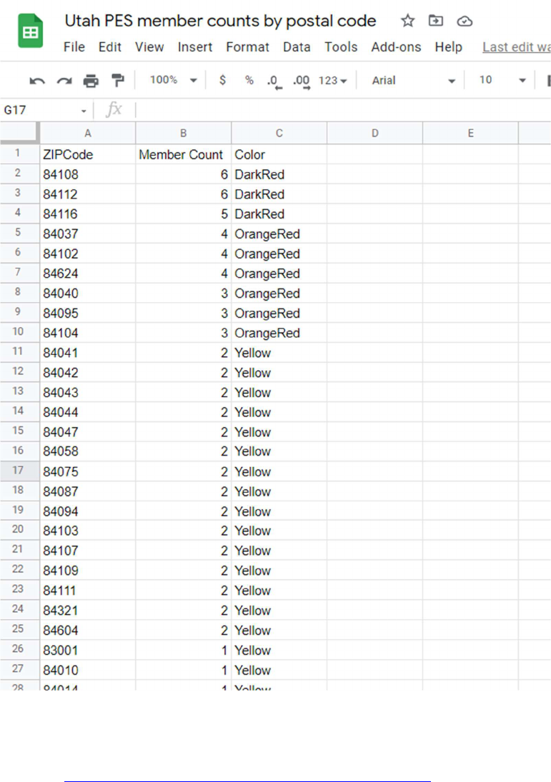
This is also a good time to rename the spreadsheet to a meaningful name. In this example I renamed it
to “Utah PES member counts by postal code”.
Step 2b. Assign colors to statistical data.
Add a third column to the right of the ZIPCode and Member Count columns. Call it Color.
Using the same guidelines from the first example, assign colors to groups of rows with roughly the same
number of rows per group.
Step 3. Display the map using randymajors.org mapBuilder tool.
Refer to the instructions in Step 3 of the first example on how to share the spreadsheet and use the
mapBuilder tool at https://www.randymajors.org/custom-color-coded-maps to generate the map.
In this example we’ve already put the correct name on the ZIPCode column. The range of Member
Count values is small enough that for this example we don’t need to replace them with range values.
Make sure you’ve deleted all the sheets except for the one with the zip codes, member counts, and
colors before you share the spreadsheet.

Here is the resulting map for the data in this example.
By clicking on the “Show labels” checkbox and zooming in, you can see labels in each zip code area with
the member counts.

This completes the examples. I hope this set of instructions is useful to you. If you have questions or
comments, please send them to Chris Gunning at [email protected] .
Document Version 2. Sept. 28, 2021. Added chapter/society example.
