The Role of Color in Minimalist Spaces: Optimizing Perception and Atmosphere
The Impact of Color in Minimalist Design
Color serves as a crucial element in minimalist design, profoundly influencing how we experience and interpret our surroundings. By thoughtfully selecting color palettes, designers have the ability to craft spaces that not only foster calm and serenity but also evoke a spirited atmosphere or create a sense of openness. This attentive approach to color is particularly relevant in environments that prioritize simplicity and functionality.
Emotional Response: Each color possesses its own unique psychological effect. For instance, soft neutrals, such as shades of beige, cream, and light gray, promote a calming ambiance, making them ideal for bedrooms or relaxation spaces. These colors can bring about feelings of peace and stability, which is why they are often used in environments meant for rest. Conversely, incorporating vibrant colors like sunny yellows or bold reds as accents can invigorate a space. These hues can energize and stimulate conversation in areas like living rooms or offices, where mental alertness and social interaction are desired. By using color strategically, designers can guide emotional responses to fit the function of the space.
Perception of Space: The choice of color also plays a significant role in how we perceive size and spatial dynamics. Lighter shades tend to reflect more light, creating an illusion of increased space that feels airier. This principle is particularly beneficial in smaller apartments or rooms with limited natural light. For example, a soft blue or pale green can open up a room, making it feel expansive and welcoming. On the other hand, darker colors—such as navy or deep forest green—can create intimate atmospheres, often making a room feel cozier and more personal, ideal for settings like reading nooks or intimate dining areas.
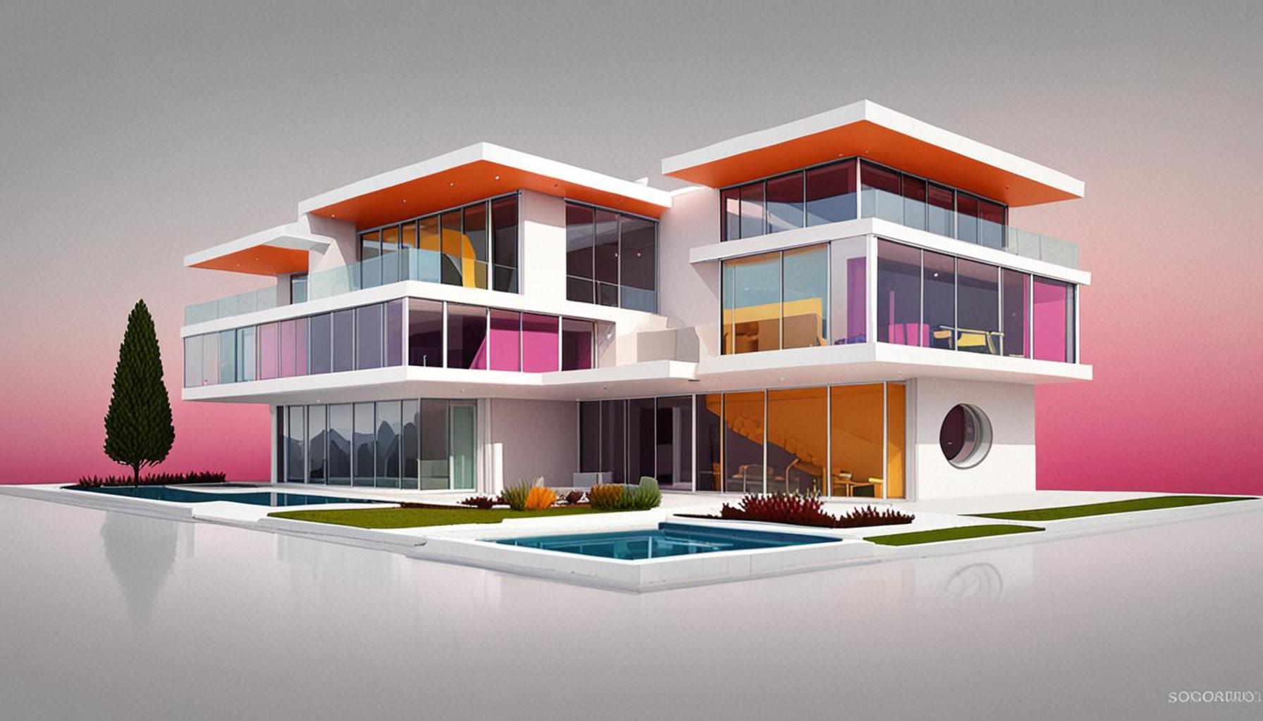
Focal Points: In minimalist designs, where simplicity prevails, bold colors act as visual anchors. A strategically placed bright orange cushion on a neutral-colored sofa or a striking piece of artwork can draw attention and break the monotony of a minimalist space. This technique not only adds interest but also assists in guiding the eye through the space, making it more engaging for its occupants.
As designers consider the synergy between color and light, the interplay of shape, and the fundamental principles of minimalist design, they begin to unlock a world of possibilities for enhancing living conditions. Investigating the following questions can deepen this understanding:
- How can specific color choices enhance the functionality of a minimalist home regular tasks?
- What are the psychological effects associated with colors in daily environments?
- Are there cultural implications regarding color that design professionals must navigate?
Exploring these questions invites a rich dialogue surrounding the use of color in minimalist spaces, revealing profound insights that encourage further examination into how we can optimize our environments more effectively.
DISCOVER MORE: Click here to learn how to optimize your mornings
Understanding Color Psychology in Minimalist Design
The interplay between color and human perception is a rich field of study, especially in the context of minimalist design. By understanding color psychology, designers can create spaces that resonate on both emotional and functional levels. Colors are more than mere decoration; they communicate mood and characteristics that can enhance our experiences in a given space. For example, utilizing a soft lavender might evoke tranquility in a bedroom, while a vibrant coral could inspire creativity in a home office.
Influence on Human Behavior: Color choices do not merely affect aesthetics; they can actively influence human behavior within the space. Research has shown that colors can affect productivity and concentration. Many tech companies, for instance, incorporate shades of blue into their office designs. This color is known to promote focus and is often described as calming, making it conducive to tasks requiring sustained attention. On the contrary, the use of bright colors like yellow or red in collaborative areas can stimulate excitement and foster collaboration. Understanding these associations allows designers to optimize spaces for productivity, relaxation, or creativity as needed.
Creating Balance and Harmony: In minimalist environments, achieving balance and harmony through color is paramount. A common approach is to utilize a monochromatic palette, where varying shades of a single color are applied throughout the space. This method can create a seamless look, preventing distractions while enhancing the ambiance. For instance, a range of grays can be complemented with textures and materials, allowing natural light to play off surfaces, creating a depth that is often lost in overly colorful designs.
To deepen this exploration further, it is essential to consider how different color combinations influence our experiences. Here are several color palettes that can optimize perception and atmosphere in minimalist spaces:
- Neutral Palette: Whites, creams, and soft grays.
- Earth Tones: Sage greens, terracotta, and muted browns.
- Cool Tones: Blues and greens that evoke serenity and calm.
- Warm Accents: A pop of yellow or soft orange paired with a neutral base for energy.
By blending these palettes carefully, designers can achieve a sense of cohesion despite the inherent simplicity of minimalism. This thoughtful combination not only contributes to a pleasing visual aesthetic but also supports the fundamental principles of functionality and purpose.
As designers explore the profound impact of color on minimalist spaces, the journey reveals how subtle hues and sharp accents can transform ordinary areas into places that breathe life and intention. The significance of color in shaping our experiences fuels a deeper investigation into its applications within diverse environments, underscoring its essential role in the art of design.
The Impact of Color Psychology in Design
In the realm of minimalist spaces, color psychology plays a pivotal role in shaping perception and atmosphere. The use of muted tones and strategic splashes of color can greatly influence mood and emotion. For instance, soft blues can evoke serenity, while gentle greens promote a sense of calm and balance. It’s important to understand how these shades not only beautify but also enhance the functionality of a room.Moreover, the contrast between colors within minimalist design can serve to highlight architectural features or define separate living areas without the need for physical barriers. Utilizing color in this way can create a sense of flow, making the space feel larger and more connected. Similarly, warm colors such as soft yellows and oranges can introduce warmth into a space that might otherwise feel stark or uninviting.Additionally, the concept of light reflection should not be overlooked. Lighter colors can help a small room feel more spacious, while darker shades can provide a cozy, intimate effect. The thoughtful application of color in minimalist spaces not only enhances aesthetic appeal but also contributes to the overall functionality and emotional impact of the environment.As you delve deeper into this topic, you may discover how different cultures influence color choices in design, as well as how current trends blend past influences with modern minimalism. Understanding these elements can further enrich the design of a minimalist space, optimizing its perception and atmosphere in remarkable ways.
Advantages of Color Usage
| Category | Description |
|---|---|
| Mood Enhancement | Colors can significantly impact emotions, promoting relaxation or stimulation. |
| Spatial Perception | Light colors create an illusion of more space, optimizing room functionality. |
Exploring the various psychological effects of colors can lead to more informed decisions in design, enhancing both aesthetic appeal and emotional resonance within minimalist spaces.
DISCOVER MORE: Click here for effective strategies
Color Schemes That Enhance Minimalist Spaces
Exploring the impact of color in minimalist design invites us to consider specific color schemes that can significantly alter the perception and atmosphere of a space. The careful selection of colors can create an ambiance that emphasizes simplicity and functionality, hallmarks of minimalist philosophy. The following color schemes can inspire both designers and homeowners to enhance their spaces effectively.
1. Monochromatic Elegance
A monochromatic color scheme utilizes variations of a single color, creating a visually cohesive and peaceful environment. This approach leans into different tones, shades, and tints, allowing textures and forms to shine without overpowering the senses. For instance, a room painted in varying shades of blue, accompanied by natural wood accents, can evoke feelings of calm and contemplation, making it ideal for relaxation areas such as bedrooms or reading nooks.
2. Contrasting Combinations
In minimalist design, color contrasts can be strategically used to highlight architectural features or focal points within a space. Pairing dark hues with bright ones adds a dynamic edge that can make minimalism more vibrant. For example, a deep navy blue wall accentuated with brilliant white furniture and decor not only draws the eye but also creates a sophisticated atmosphere. This approach celebrates the less-is-more mantra by allowing key elements of the room to stand out without overwhelming the design.
3. Pastel Serenity
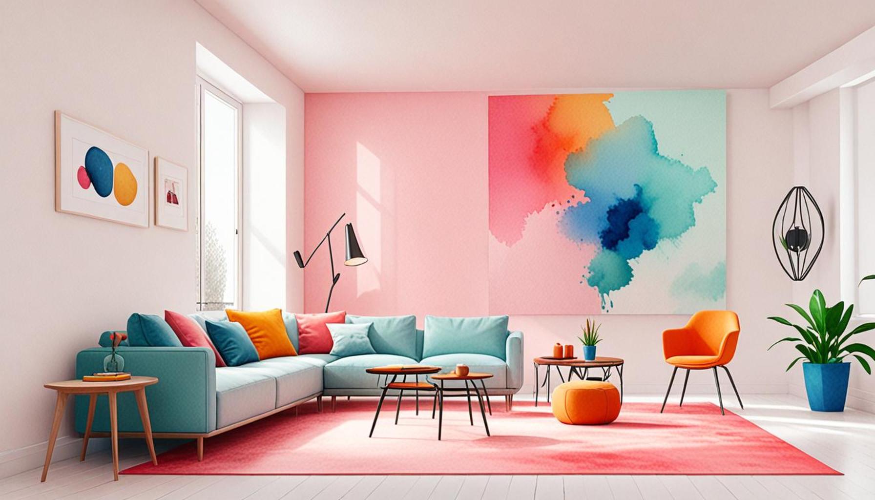
Pale colors, particularly pastels, encourage tranquility while maintaining the minimalist ethos. Creamy tones of blush, mint, or lavender infused into a space can create a light and airy feel, making environments appear larger and more inviting. A living room designed with soft pastel hues, paired with minimalistic furniture, cultivates an atmosphere of ease and serenity, ideal for gatherings or quiet moments.
4. Nature-Inspired Hues
Drawing inspiration from nature can serve as an effective strategy in minimalism, with earth tones being particularly relevant. Shades such as warm beiges, muted greens, and rust can ground a space while fostering a sense of connection to the environment. Integrating these colors enhances a minimalist space by making it feel organic and balanced, perfect for homes that aim to be both stylish and nurturing.
5. Bold Accents in a Neutral Landscape
While neutral tones serve as a foundation in minimalist design, incorporating bold colors as accents can energize a space without breaking its simplicity. A room painted in a soft gray can be enlivened with the addition of bright yellow pillows or a deep red artwork. Such strategic pops of color can invigorate an otherwise understated design, invoking feelings of joy and enthusiasm while remaining true to minimalist principles.
The interrelation of these color schemes with the minimalist approach highlights how strategic color choices can optimize the perception and atmosphere of spaces. By deliberately selecting colors that communicate desired emotions and behaviors, designers can elevate minimalism from mere simplicity to a purposeful art form, transforming how we experience our everyday environments.
DISCOVER MORE: Click here to unlock your creative potential
Conclusion
In summarizing the pivotal role of color in minimalist spaces, it becomes clear that selecting the right hues is instrumental in shaping our perceptions and enhancing the overall atmosphere of our environments. Minimalism thrives on the principle of ‘less is more,’ and the strategic application of color can elevate this design philosophy into an impactful and intentional experience. Whether opting for the serene beauty of a monochromatic scheme, the invigorating charm of contrasting combinations, or the gentle embrace of pastel tones, each color choice offers unique psychological effects that can promote relaxation, focus, or creativity.
By grounding spaces with nature-inspired hues or energizing them through bold accents, designers and homeowners alike can cultivate harmony and balance. It’s important to recognize that color is not merely an aesthetic choice but a means of communication that influences emotions and interactions within a space. As we navigate our daily lives, the hues that surround us can subtly but profoundly shape our experiences.
Ultimately, understanding and leveraging the interplay of color in minimalist design invites us to reconsider the environments we inhabit. As we embrace this exploration further, one might discover that even the simplest elements—color included—can transform our spaces into intentional sanctuaries that reflect our values and aspirations. The journey into minimalist color schemes is not just about visual appeal; it is about crafting atmospheres that resonate with who we are and how we wish to feel in the world.